Difference between revisions of "User:Thirty7/Sandbox/Drop Icons"
m (→Final Version!) |
(removing other bits) |
| (7 intermediate revisions by the same user not shown) | |
(No difference)
| |
Latest revision as of 09:10, 11 April 2012
Contents
New Recipe Rarity Icons
Original
As used by {{DropRecipeHead}} currently:
Common · Uncmn · Rare · Very Rare · Mish Drop · Task Force Drop · Player vs Player · Special ·
Proposal 1
My suggestions for new icons (mostly in the same order with the addition of a temp power and costume recipe added):
The only icon that might need a bit of explanation is that of the Mission Drop symbol. Since I didn't want to use a badge and there is no concise symbol that means mission to everyone, I went with a symbol whose color scheme is influenced by the current symbol in use (the Hero accomplishment badge) and added the 8-pointed star as used on the Villain Accomplishment badges... plus, it sorta kinda looks like the little explosion symbol that is used on the in-game map to represent a mission door.
Proposal 2
In addition to the above (which I really do like the PvP, Mission and Temp/Costume images above), are these:
Proposal 3
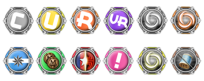
I went back to exclusively using symbols, and the rings. I really feel like the rings add to the aesthetic and make them look "finished," especially the PvP one. I included lettering that is angled to add a bit of visual interest on the "simple" rarity pools only. Another notable change, is the use of the Merit Reward token salvage piece to denote the former TF Drop pool. I think that fits better than the salvage bag, and the old TF icon and/or lettering. Might I suggest using RM as the internal code for Reward Merit Pool? I also intesified the use of color on the Temp Power symbols... because adding a superimposed letter OVER the symbol was too busy and looked horrendous at a small scale (even with an opacity adjustment). Of all the suggestions I have done so far, this one is by FAR my favorite.
Final Version!
Hopefully, these are the final versions for this little project!


